CASA · KITCHENS
A kitchen that made us reconsider red
Turns out red isn’t loud. It just needs better company.
Warm, lived-in and nowhere near as intimidating as we thought.
For a long time, red kitchens lived in the same category as red cars, red lipstick and people who order tequila before dinner: confident, dramatic and absolutely not for everyone.
Then we saw this one.
Deep brick-red cabinetry. A pale stone worktop. Old wood. Linen. Brass. Bowls that look like they’ve been there for twenty years. Suddenly, red stopped feeling bold for the sake of being bold and started feeling warm, grown-up and slightly addictive.
The trick, apparently, is not asking red to behave like a statement colour. Let it behave like a neutral with opinions.
Maybe red was never the problem. Maybe shiny red was.
01 · Pick the right red
Go deeper, dirtier and less perfect
The reds that work best in a kitchen rarely look like true red. Think brick, oxblood, burgundy, rust or something with enough brown in it to calm everything down.
These shades have depth. They change with the light. In the morning they can look almost terracotta; by evening they become moody and wine-dark.
That movement is exactly what keeps the colour from feeling flat or overly designed.
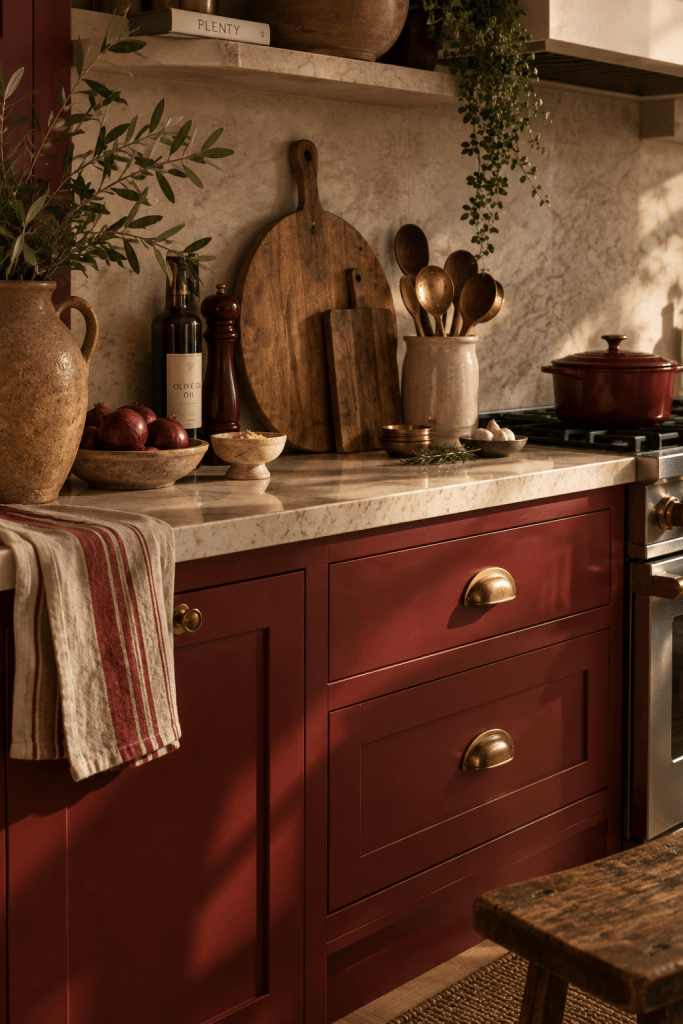
Deep red works best when it feels a little dusty, a little old and definitely not glossy.
02 · Give it something quiet
Pair it with things that don’t compete
If the cabinets are doing the talking, the rest of the kitchen can keep its voice down.
Creamy stone, chalky plaster, old oak, woven baskets and simple linen are red’s best friends. They soften it without making the room feel beige and apologetic.
And if you’re adding metal, brass is almost suspiciously good. It warms the red further and gives the whole space that collected-over-time feeling we’re always chasing.
03 · Don’t make everything red
Restraint is doing a lot of work here
The red works because it isn’t everywhere.
Keep the walls calm. Let the worktop stay pale. Leave some shelves in natural wood. Give your eye somewhere to rest before you ask it to look at another cabinet.
A strong colour becomes much easier to live with when it has enough negative space around it.
04 · Let the kitchen look used
The styling matters almost as much as the paint
Red can look formal very quickly. The antidote is life.
A pan left on the stove. Lemons in a bowl. A wooden board leaning against the backsplash. A tea towel that isn’t folded for the photograph. A lamp on the counter because kitchen lighting deserves better than ceiling spots too.
The less precious the room feels, the more convincing the colour becomes.
The room should feel like someone cooks here, not like someone approved it in a showroom.
05 · Start smaller if you’re nervous
You don’t need to paint the whole kitchen tomorrow
A freestanding cabinet. The kitchen island. A pantry door. Even a red lamp or a few burgundy dining chairs can give you the same warmth without requiring a complete identity crisis.
And if you love it? You know where the paint aisle is.
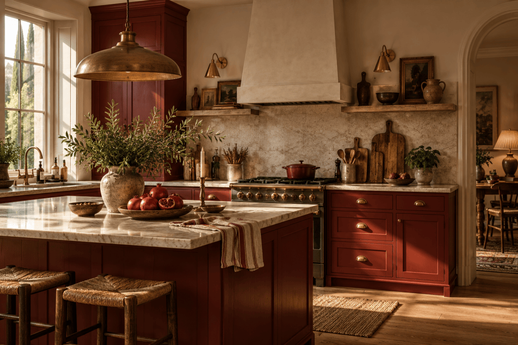
So, are we painting the kitchen red?
Not necessarily. But we’re no longer ruling it out, which feels like progress.
Give us deep red cabinets, old wood, pale stone and a lamp glowing on the counter and apparently we’re very easy to persuade.
More personality, please.
Casa Mellow is about homes that feel lived in, colours worth reconsidering and decorating decisions that are slightly more fun than sensible.

